Posts

Image
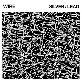
Wire Pinkflag, 2017 Dinosaur punk bands are always a reluctant listen.  Thankfully two of the original members of Wire remain, which can be problematic after decades pass since their first release, in this case Pink Flag in 1977. First off, I'm happy their guitar tone hasn't been victim to the technologies of the 80's and 90's, peavy amps, fender squires, and orange boss distortion pedals.  You can see a bit of the "alternative" rock sound, with a bunch of reverb reminiscent of My Bloody Valentine.  So actually they have aged well. The vocals are a bit low pitched in comparison.  The vocals on this album are almost fitting for a progressive rock group, like King Crimson or Brian Eno.  Not necessarily a bad thing, the John Lydon thing gets tiresome if you pass the age of 40. When the guitars go into the chorus laden dream pop realm, I start wondering if I'm listening to Blue Man Group.  At least they're doing a lot better than Alice Cooper
Image
  Paul Pope Vertigo , 2002       From slightly off the beaten path, yet still a conventional action oriented comic, Vertigo brought us Paul Pope's 100%; a book which envisions a gritty, futuristic urban stage for a drama which gives obvious nods to Bladerunner and the 5th Element, trading away some of the violence for romance and emotional expression.             Most striking is Paul Pope's inking style.  In the liner notes he refers to the inking process as a "pure bliss" he looks forward to, while everything else is tedium.  Proportion is sent through his intuitive, selective fish eye lens.  Every object is reflective of an interpretive whim, mood dictating application and even atmosphere.  The drawback to this approach is of course lost clarity, which is most noticeable in his facial features, conjured up without enough deliberation, tending to resemble the artist in real life.  I feel they are wearing his lips, regardless of gender.      
Image
  Pantheon, 2011  Hardcover          Mr. Clowes is famous.  And like any heavyweight, there are hungrier, younger competitors trying to say he's getting soft, like an old man who should bow out of the ring.   " Mister Wonderful ," a 76 page short story following suit with the previous year's " Wilson ," stars a tired, alienated Charlie Brown / Woody Allen hybrid, complaining about the state of the world and his lackluster sex life.            The classic yet streamlined style of Clowes straddles antiseptic symbology and childish daydream, a pragmatic articulation that is gently persuasive.                       Our protagonist unintentionally bungles his way through a blind date with the unbelievable serendipity of Batman solving another disposable case.  He socks a purse snatcher, skirts teeth clenching romantic faux pas at every instant, somehow managing not to offend the blonde, mousey object of his affection who shares a cup of cof
Image
Max Tilmann MNRG, Portugal Hardcover  This man is a painter from Dusseldorf, Germany and has studied at the Art Academy there.  I see similarities to Basquiat and Keith Haring here.  The shock value of the images is horrific.  There are references to every crime known to humanity and social problem.  The way they are framed in a brutish painting style lends the subjects a sterile anonymity that frees us from the pain of witnessing, enduring. Does compassion go dry here?  I feel in the "brutal" lines the brush did not jump, deviate, or dry out with any sort of anxiety. What message is expressed in the muted variance and the calmly nuanced movement of the hand and the brush?  These minimal compositions with their simple yet conscious application guide us gently through the carnage of human interaction, inequality, and vapid reflection... He draws the subjects of senior citizens undergoing sexual slavery, dying abortions and smokestacks with the calm innocence of a Ane
Image
"SWAMR!" And Various Work Michael Olivo Oakland CA 2012 Self Published I've been blogging about this particular illustrator a lot recently but wanted to formally congratulate him for having a sensibility that is simultaneously refreshing, hard edged, clean-lined, and downright hilarious, even mysterious. Recently he has had a spot in the New Yorker, and also has been blogging for Beautiful Decay.  He was also featured in a  large anthology put out by Andy Burkholder in Chicago for the annual zine fest "CAKE."  .   His work reminds me of a shattered realm viewed through broken glass.  Keith Haring and Kiki Picasso collide in a realm of deadpan non-sequiturs, cryptic humor, and air-plane safety manuals. There is so much humor in the work, I find myself cracking up.  For example the small color strip "Sewer Dongs" has to be the funniest thing I've seen in 6 months.   There is little to no dialogue, but the silent Futurist Absurdi
Image
Reset #1 Peter Bagge 2011 Dark Horse   Peter Bagge first got famous in the 90's with his epic creation, HATE, starring an angst-ridden cast of grunge hipsters in Seattle, and later Jersey.  I couldn't help but be blown away by the pacing, acrid dialogue and hilarious situations that struck way to close to home even now as a struggling bohemian with a bad temper and a drinking problem. However it is 2012, and Peter Bagge has decided to try his hand at other subject matter, which is science fiction and midlife crisis.  I read the first installment of this which was handed to me by a friend in Oakland, CA with the warning of "It sucks."  A lot of artists get softer in their old age and want to do work that either perpetuates their previous modus operandi in a watered-down way or takes a turn in an awkward way... I feel that this story is the latter.  Chris Ware and Dan Clowes switched up their subject matter to themes personal to them as they got older, and so d
Image
Alien Invasion Volume II 2012 Lala Albert, NYC http://plslala.blogspot.com/ Self Published   While in NYC, I was given this Zine by the artist Lala Albert at a private comic book sale near Chelsea in Manhattan.  The cover was a day-glow reference to our lost adolescence.  I first encountered her drawings in Vice Magazine a year or two ago.  The eyes and the Anime faces were a mysterious combination of artistic concentration and utter kitsch that were fascinating and hilarious... She also did quite a good job with her piece that appeared in Happiness #2 this year, a Zine printed in NYC by Leah Wishnia.  http://happinesscomix.tumblr.com/ Initially I assumed her work to be done by a 19-21 year old male.  The subject matter never varies.  The women are waif-like and always sport the grotesque, reptilian eyes.  The consistency of this theme, application and prolific output speak of maturity which conveys the irony. The naked woman theme and the strong presence of Anime in